
Since the installation of President Richard Corcoran, the familiar visage of New College has refigured itself in a series of marketing campaigns. To many, this change may be unexpected, but for New College’s administration these marketing decisions have been part of a broader shift in campus goals. The Catalyst spoke with current students and alumni about changes in the college’s visual and architectural identity.
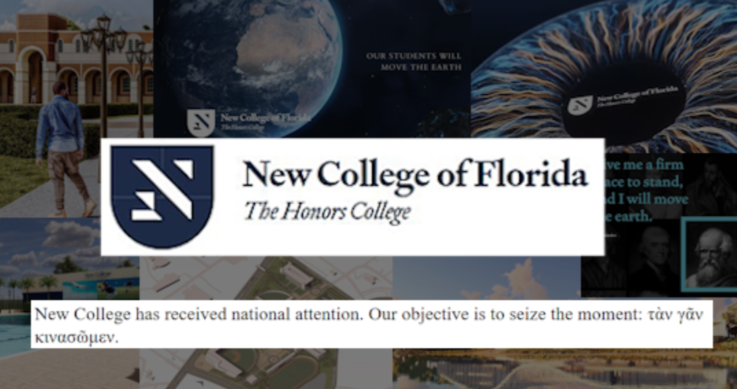
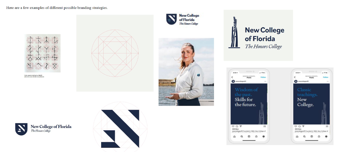
In June 2023 the New College Board of Trustees (BOT) took its first step in changing the New College image, eschewing the Null Set mascot for the “Mighty Banyan” designed by then first-year Anna Lazzara. A step further was taken in August 2023 when the BOT approved the New College Business Plan, which emphasized a proposed solution to New College’s declining market position: luxury branding.
According to the Business Plan, “New College must establish market leverage, and the college’s other objectives are all integrated into this branding and communication strategy.”
The plan included unfamiliar promotional materials such as a modernist stylization of an “N” on a badge, a new typeface and a logo based on the Robert and Beverly Koski Bell Tower, rather than New College’s traditional Four Winds.
“The symbols that the college had, the Four Winds, the Null Set, those really reflected the culture of the students and what the school was really about, which was finding your own path,” Kennon Gilson (’23) told the Catalyst via email. “The great thing about the old promotion was that it stayed out of the way, while the new promotion feels a lot like a fake identity that’s being imposed onto the school.”
“I think that the branding that has recently been created undermines the existing material such as the New College Seal, an important aspect of New College culture and identification. It seems exceedingly unnecessary to create new marketing material when a fantastic option already exists,” second-year Maya Rish wrote to the Catalyst. “The current New College seal is a design that draws on classical history and works of art to represent life, vitality and newness, inspiring students and representing everything that the school stands for, while simultaneously based in a history the administration seeks to highlight. This change is very confusing for me not only because I personally find the Four Winds to be a great design, but also because it represents both the existing culture, and the change in ideals.”
“I liked the Four Winds, because in that symbol, everything is flowing and free. The new logo makes me feel as though I’m about to attend the naval academy where parents send their unruly kids to,” Gilson remarked.
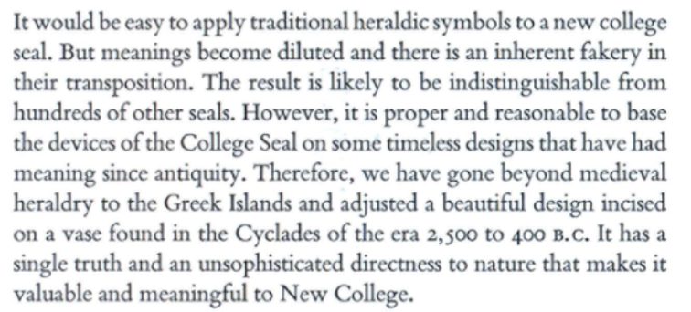
“The Four Winds reminds me of the welcoming and unique nature of the New College that I consider home, and is a comforting symbol . . . I think as an art history student, and based on Professor Carrasco’s previous research, it is significantly deeper and has a stronger communication with the “classics,” connected to cycladic, pre-classical artwork, and a motif in ancient cultures,” third-year Art History Area of Concentration (AOC) Natalia Benavides said. “It is pictorially more aesthetically pleasing than this new logo, that seems like an attempt at capturing a common heraldic style, seeking to liken itself to a tradition of imagery used at many institutions featuring a shield-like symbol, but this “N” seems more like an incoherent collection of geometric forms.”
At the beginning of Fall 2023, New College began supplying incoming students and student-athletes with branded merchandise sporting new logos and selling separate sports merchandise on their own site, leaving the old New College merchandise site with only a static image. When asked by the Catalyst, a staff member at the New College/USF Bookstore stated they were unable to give comments on third-party vendors to their parent company. There has been no communication about whether the Four Winds and current New College typeface will be discontinued in the future.


Included in the Business Plan are several unfamiliar mock-ups for architectural fixtures, and some that may be familiar, as changes to College Hall and the Recreation Center at the start of Fall 2023 have reflected schematics within the Business plan. The buildings and promotional material have donned the Oxford blue, as well as the Mighty Banyan’s bronze sheen. It is unclear how many of the additional mock-ups are intended to be developed.

The new paint job on the Recreation Center versus the mockups in the Business Plan. Photos courtesy of Riley Bucklin. 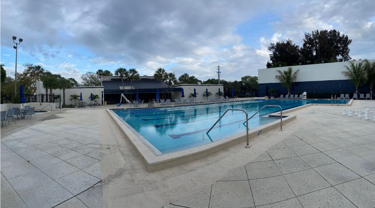
The new paint job on the Recreation Center versus the mockups in the Business Plan. Photos courtesy of Riley Bucklin. 
The new paint job on the Recreation Center versus the mockups in the Business Plan. Photos courtesy of Riley Bucklin. 
The new paint job on the Recreation Center versus the mockups in the Business Plan. Photos courtesy of Riley Bucklin.
“It’s [the new logo and color scheme] more reminiscent of a corporate style, trying to copy and blend in with other institutions, which goes against everything New College stands for,” Benavides added. “They’re trying to set a more serious corporate, bureaucratic tone, instead of representing a free-thinking institution with a deep history and tradition . . . with students interested in expanding their world view in ways relating to what the original logo and color represent.”
The Caples bayfront design for a boathouse was recently advertised as a goal in the Caples Historic Tour brochure created by Lazzara. The back of the same brochure displays a renovated design for Caples, branded by Sarasota-based design company Hall Darling. Hall Darling was additionally present as the architects at the Jan. 22 Master Plan update to facilitate and suggest changes, mentioning that the master plan activities would include work with firms including designLAB architects, STOSS Landscape Architects, BGE Inc. and S3 Design. Following a similar architectural direction, the architectural firm Sweet Sparkman was selected by New College’s “Reimagining Pei” competition.
In early 2024, a slew of promotional videos joined the arsenal of New College’s marketing material. Around Jan. 11, videos on the New College site began to promote the new online courses using a library of documentary clips. Following this would be similar videos made available on the official New College YouTube, containing popular figures such as Fareed Zakaria and Elon Musk giving inspirational speeches. Many students discovered the use of the heraldic “N” logo through the premier of these videos.
“It [the initial promotional video] was not reflective of the school I’m currently attending,” Benavides stated. “It seems like these videos were made without consulting faculty, the student body, or anyone in the community. They’re trying to mimic other institutions, and are not highlighting any [of New College’s] deeper history. I would not choose this school if I was shown this video; the identity confusion is apparent and misleading.”
On Feb. 7, New College had its second ever “New College Day” in Tallahassee, where students and administrators traveled to the Florida Capitol to meet with politicians, advocate for support and highlight the school’s accomplishments. Students who had not watched the video premier of the new logo would later discover it through its appearance on the New College Instagram in a photo of the college’s table at the Capitol. Students in attendance that day were similarly surprised by the logo change.
“That day at the Capitol, I was pulled aside to table and hand out brochures and NCF merch,” New College Student Association (NCSA) Vice President and second year Kyla Baldonado told the Catalyst in a text message. “When I went out to the hallway, I was confused because the logo on the tablecloth and the tarpaulin was not the NCF logo I was familiar with and I had never seen it before. I was tabling with someone from the President’s office, and asked her about it. She told me it was part of NCF’s rebranding.”
Soon after, New College’s Communications and Marketing head Nathan March told the Miami Herald that New College had contracted Taryn Fenske, former public spokesperson for Gov. DeSantis’ office, under the name TMF Communications, LLC for $15,000 a month since July 2023 to aid in creating the new promotional material.
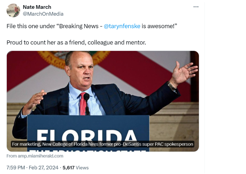
When told of Taryn Fenske’s involvement from Tallahassee, Benavides added, “Of course someone who is not on site is making the video that is supposed to represent the institution. That is very upsetting and speaks to the blatant political intervention. . . to find out that someone that close to DeSantis is in charge of such a large aspect of our marketing here, without being in proximity to the school or directly discussing with anyone on campus, unfortunately makes sense… very out of touch with what is being experienced at New College.”
“Personally, I do not find these changes to be a sign of mutual understanding, or welcoming to the student body. It seems to me that the change in branding originates from a desire to alter the messaging of the school, to rebrand the exterior presentation of New College,” Rish commented.
“The creation of new material only serves to muddle the waters and take away from the unified front that should be a marketing and branding system. It confuses me that they would seek to completely alter what exists without consulting the student body, or evaluating what they seek to present . . . My fear is not that the new branding will damage the school, but rather the blatant lack of interest in student input is what I find exceedingly concerning. If the administration was seeking to replace the seal with something else, wouldn’t they want to consult their constituents? This is what I find problematic with the action that is being taken. I fear the change and its authoritarian development. ”
New College Communications Director Nathan March, TMF Communications manager Taryn Fenske and Architectural Firm Hall Darling did not respond to the Catalyst’s request for comment.