
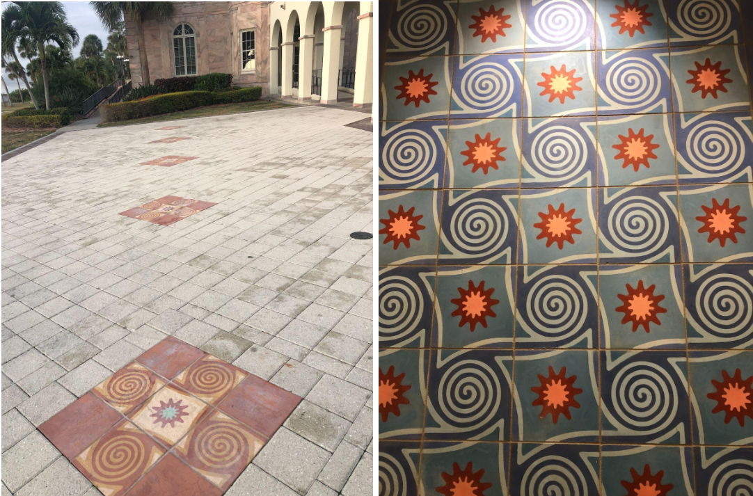
Professor of Art History Malena Carrasco didn’t know that she would become obsessed with the New College seal. She hadn’t expected to find an internal argument within a future world-famous architectural firm. She’d only been curious about something most Novos, including herself, had overlooked. Where did this symbol, the Four Winds, come from? Who designed it? The answers would emerge after months of digging in the New College archives.
Carrasco had been asked to create a lecture on a subject related to the Odyssey for the new class premiering this semester. She was looking for a connection between classical Cycladic art and the New College seal, from which the design seemed to be inspired.
“I was aware, of course, of the Four Winds. It has always just been there, in the background. But it was nothing I got excited about, until of course I started looking at it,” Carrasco told the Catalyst. “To be totally honest, this sort of took over my life for the first part of the semester. I really dug into it. … It was what I wanted to work on the most. Any time I had a free moment I thought, ‘let’s see what else is there.’”
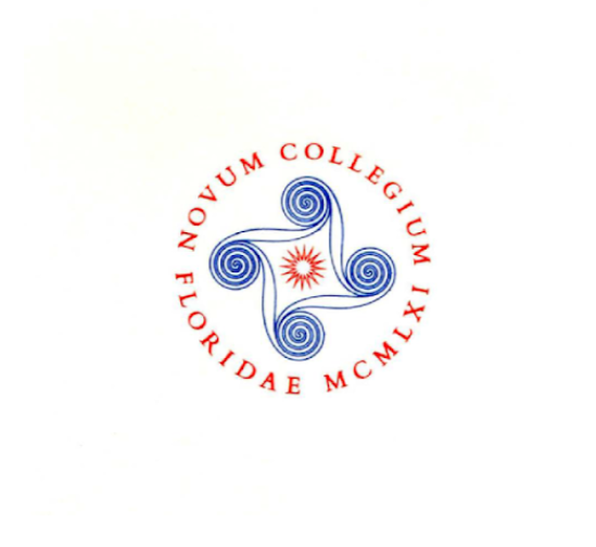
The story begins with the founding of New College in 1960, and the mission to create a seal for the school that would be emblematic of everything it hoped to stand for. George Baughman, the first president of NCF, hired the up-and-coming New York-based I.M. Pei Associates created the foundations for the school, and the studio focused on shaping something that would be unique. The designer, whom Carrasco believes was most likely architect and graphic designer Don Page, began work on creating a seal that would be different from those identifying well-respected institutions of the past, deliberately avoiding the typical shield and coat of arms from the European Middle Ages.
According to documents provided to the Catalyst by Carassco and available in the New College archives, the designer expressly avoided “traditional heraldic symbols,” hoping to distinguish the design from “hundreds of other seals.”
A written narrative from I.M. Pei Associates explains, “It is proper and reasonable to base the devices of the College Seal on some timeless designs that have had meaning since antiquity. Therefore, we have gone beyond medieval heraldry to the Greek Islands and adjusted a beautiful design. … It seems fitting that New College should have a mark with its beginnings in ancient Greece, modernized for present day use and which expresses the completeness, the quality and the dynamic activity of this newest educational institution.”
Inspired by creating something unique to the school, the designer went as far back as possible in classical art, so far back it’s not even really considered classical. Returning to the very beginnings of Western civilization created a fresh start, superseding the later heraldic traditions.
“Cycladic art is the first stage of what we call the classical tradition, meaning Greco-Roman art. … Scholars who work in Cycladic art, they now say that they are working on what constitutes the cradle of Western civilization, so if you wanted to draw a through-line from classical antiquity as we now understand it, up to the present, that’s where you would start,” Carrasco explained.
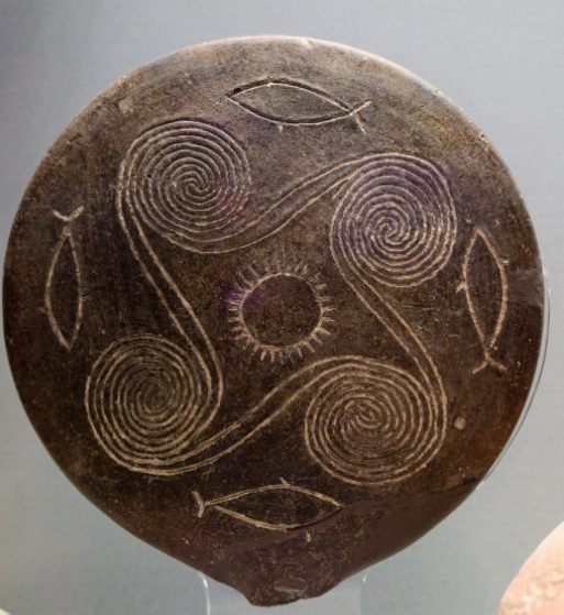
Carrasco knew the inspiration for the seal was drawn from Cycladic art, and in her research she rediscovered the source the designer drew from, a ‘frying pan’ depicting spirals and fish dated from 2800 to 2700 BCE. “We have gone to the Greek Islands and adjusted a beautiful design … It has a timeless truth and an unsophisticated directness to nature that makes it valuable and meaningful to New College,” I.M. Pei Associates wrote.
The original design had been filled in with thick blue lines, bold red type, a red sunburst and star in the middle.
“If you want to get into the essence of an institution, you want to keep it simple. … [The seal] didn’t look like anything else that other colleges were using,” Carrasco said. “I developed a tremendous respect for the designer of the Four Winds. He really put a lot of thought into what he was doing and why, and he spent time figuring out what the school was trying to be and there weren’t any students yet when he was working on it—to try to get the college’s essence into a visual emblem when the place barely existed.”
According to Carassco, Baughman and I.M. Pei and Associates initially disagreed on the colors, and several iterations included red and blue, green and blue and white, gold and blue, before settling on blue and white, the official school colors seen today. According to a letter from Baughman in Sept. 1964, the seal had been “most enthusiastically received by all groups,” including the first students at the college, the Charter Class.
Since then, the Four Winds has undergone more changes to its appearance. “Any time you’re thinking about the institution’s essence and identity, you will go and look at the seal,” Cassasco said. She cited examples such as the merger with the University of South Florida (USF) in 1975, when the seal was “a real point of contention, USF wanted it to disappear.” According to Carassco, the faculty fought to keep the seal as it was, with slight modifications to the Latin writing, adding “Universitatis Meridianae Floridae MCMLVI.”
The seal changed again after New College gained its independence from USF in 2001, when in 2015 Professor of Classics and Latinist David Rohrbacher corrected an error in the Latin writing surrounding the seal. Rohrbacher’s article on that error can be found here. The original said “Novum Collegium Floridae,” but after independence when the institution’s name changed to “New College of Florida,” this language was no longer accurate. Rohrbacher spearheaded the mission to “raise consciousness about the ungrammatical nature of the New College seal,” and eventually corrected the language to “Novum Collegium Floridense.” He referenced the similarity to the wording on the seal of New College, Oxford, which reads “Novum Collegium Oxoniense.”
Most recently, the creation of the Might Banyan mascot has left some wondering about the continued relevance and significance of the Four Winds. To this issue, Carrasco differentiates the two symbols.
“Images serve different purposes. If you’re running an intercollegiate competitive athletic program, you want an image that’s maybe feisty and will fire up the troops. And maybe a muscled-up banyan tree does that,” she explained. “… the proof is in the staying power.”
“With a college that’s had so many changes, it’s kind of wonderful to have some thread of continuity,” Carrasco said.
She emphasized how the seal has continued to accurately represent New College throughout the many changes since its founding, drawing on an untouchable legacy left by the designer that spans thousands of years of history.
“What is really distinctive about us is the individualism, and that’s a hard thing to get into an emblem. … I would never say that it’s just a symbol, because a really great symbol encapsulates so much, and this one really does,” Carrasco stated.
“I would love to see, of course, the Four Winds continue indefinitely. As President Baughman says, it ‘will become the hallmark of a new institution for centuries to come with the timeless value of the spirit of the seal.’”